
Standard Research Paper Font and Size
Introduction
Choosing the right essay format is not a minor detail. For medical students, clinicians, and researchers, font and size affect readability, submission compliance, and first impressions. A paper can be rejected or delayed because the formatting is wrong, even when the science is strong. In this guide, you will learn the standard research paper font and size rules, why journals care, and how to prepare a clean manuscript faster.
1. What “Standard” Means in a Research Paper
1.1 Follow the journal, not a personal preference
There is no single universal font rule for every journal. The safest standard is the one listed in the target journal’s author guidelines. Still, many journals share the same basic expectations.
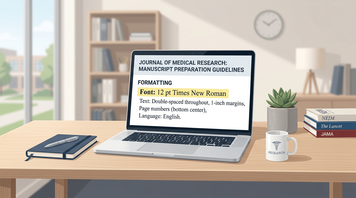
The most common manuscript font is Times New Roman or Arial, usually 12 pt. For body text, line spacing is often 1.5 or double. For figures and tables, journals may allow smaller sizes, often 6 to 12 pt, as long as the text remains readable.
The key rule is simple: standard formatting improves review efficiency and reduces avoidable technical rejection.
1.2 Why font and size matter in academic writing
For an essay or research manuscript, formatting affects more than appearance. Editors and reviewers read dozens of submissions. A clean layout helps them find the logic, methods, and results quickly.
Poor formatting can cause three problems:
- Reduced readability.
- Extra revision requests.
- Rejection for not following submission rules.
In medical publishing, where precision matters, this is especially important. A clear manuscript also supports trust. That matters for evidence-based audiences who need accuracy and consistency.
2. The Most Common Font and Size Rules
2.1 Main text format
For most academic submissions, the standard choices are:
- Font: Times New Roman or Arial
- Size: 12 pt
- Line spacing: 1.5 or double
- Alignment: left or justified, depending on journal rules
- Margins: often 1 inch, but confirm with the journal
These settings are widely accepted because they are easy to read and easy to edit. They also produce a professional look across Word and PDF submissions.
If the journal does not specify a font, use one of these two. Do not mix fonts in the same manuscript unless the journal asks for special formatting.
2.2 Headings, tables, and figure labels
Headings should be clear and consistent. Most journals accept the same font family for headings, with larger size or bold formatting.
For tables and figures:
- Use a readable font, often Arial or Times New Roman.
- Keep labels large enough to read after reduction.
- Avoid decorative fonts.
- Keep figure text consistent across all images.
A good research paper font and size should still be legible after the figure is scaled down for publication.
This point matters because figure text is often reduced during layout. If the font is too small at the start, it may become unreadable in print or PDF form.
3. Font and Size Rules for Figures and Tables
3.1 Figure resolution and text clarity
From a practical publishing standpoint, figures need both the right font and the right resolution. A clear graph can still fail if the text is blurry. Based on common journal standards, line art often requires over 1000 DPI, color or grayscale images over 300 DPI, and combined figures over 500 DPI.
That means font choice alone is not enough. You also need:
- High-resolution export.
- Consistent label size.
- Simple layout.
- Correct file format.
For line charts, scatter plots, box plots, and trend lines, use clean labels and avoid crowded axes. Medical papers often include clinical data comparisons, so each data point and axis title should remain sharp.
3.2 Table formatting for clinical manuscripts
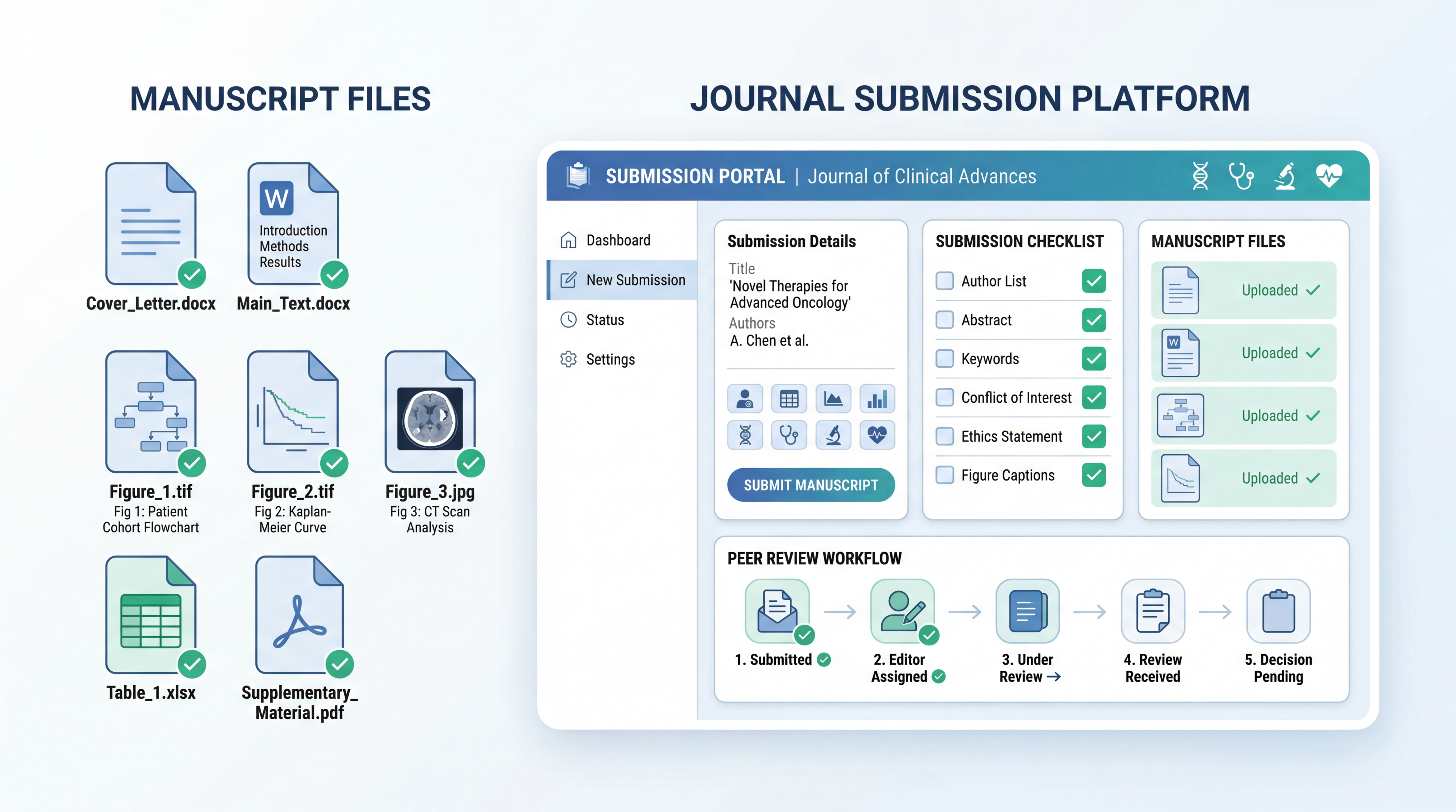
Tables should be simple. They should present baseline data, group comparisons, or key outcomes without unnecessary decoration. In many submission systems, tables are placed after the main text or uploaded separately.
Use the following principles:
- Keep table font consistent with the manuscript.
- Avoid very small text.
- Use only essential borders.
- Make column titles short and specific.
For medical research, a table often summarizes sample type, inclusion criteria, lab methods, or patient characteristics. A clean table helps reviewers verify the study design quickly.
4. How to Choose the Right Format Before Submission
4.1 Check author guidelines early
Before writing, review the target journal’s instructions. Look for requirements on:
- Font family
- Font size
- Line spacing
- Margin size
- Figure format
- Table placement
- Word or PDF submission rules
Some journals ask for a combined manuscript file. Others want the manuscript, tables, and figures uploaded separately. If you know this early, you save time later.
This is especially useful for medical students and researchers who need to revise quickly between journal submissions.
4.2 Build your essay with publication in mind
If you are writing an essay for academic submission, build the document with formatting control from the start. Do not finish the paper first and fix style later. That usually leads to extra work.
A practical workflow is:
- Choose the journal first.
- Download the author guide.
- Set the font and size before writing.
- Format headings, tables, and figures as you go.
- Export a final PDF only after checking every section.
This approach reduces formatting mistakes and makes the manuscript easier to submit.
5. Common Mistakes to Avoid
5.1 Do not assume all journals use the same style
Many authors make the mistake of using one template for every paper. That can work for drafts, but not for submission. A journal may require a specific font, reference style, or file type. Some require TIFF images, while others accept JPEG or EPS for figures.
You should never assume that a clean-looking paper is automatically compliant. Compliance means matching the journal’s instructions exactly.
5.2 Do not use tiny text to fit more content
Small fonts can make the page look dense, but they hurt readability. They also increase the risk of rejection for poor presentation. The same applies to tables and figure captions.
Keep in mind:
- Readability matters more than packing content.
- White space improves scanning.
- Consistency makes the paper look professional.
For doctors and researchers, time is limited. Reviewers appreciate papers that are easy to navigate. A clear format helps them focus on the science, not the layout.
6. A Smarter Way to Prepare Manuscripts
6.1 Use a workflow that reduces formatting burden
Writing and formatting academic content can take more time than expected. This is where a structured tool can help. Scifocus.ai can support researchers who need faster manuscript preparation, better organization, and cleaner academic output.
Instead of spending hours adjusting spacing, checking alignment, and reformatting figures, you can use a smarter workflow to streamline the process. That matters when you are preparing multiple submissions or working under a deadline.
6.2 How Scifocus.ai can help
For medical students, physicians, and research teams, the main pain points are usually the same:
- Repetitive formatting work.
- Inconsistent layout across sections.
- Time lost correcting submission details.
- Stress before journal deadlines.
A tool like Scifocus.ai can help you manage manuscript structure more efficiently and keep your essay or paper presentation more consistent. That means less manual cleanup and more time spent on the actual research.
When your formatting is under control, your manuscript looks more credible and is easier to submit.
Conclusion
The standard research paper font and size are not just style choices. They are part of publication quality. In most cases, Times New Roman or Arial at 12 pt is a safe starting point, but the journal’s author guidelines always come first. Keep figures sharp, tables simple, and formatting consistent from the beginning.
For any essay or research manuscript, the goal is clarity, compliance, and professionalism. If you want to save time and reduce formatting stress, consider using Scifocus.ai to streamline your writing workflow and prepare cleaner submissions faster.
Did you like this article? Explore a few more related posts.
Start Your Research Journey With Scifocus Today
Create your free Scifocus account today and take your research to the next level. Experience the difference firsthand—your journey to academic excellence starts here.