
How to Write a Graphical Abstract That Editors Notice
Introduction
A graphical abstract can decide whether your paper gets opened, skimmed, or ignored. For medical students, doctors, and researchers, the challenge is not only to summarize an essay clearly, but to do it in a format editors notice fast. A strong graphical abstract should be accurate, concise, and visually logical. It must communicate the study’s purpose, method, key findings, and takeaway in seconds.
1. Why editors pay attention to a graphical abstract
1.1 It reduces reading friction
Editors review many submissions quickly. A clear graphical abstract helps them understand the paper’s value before reading the full essay. That matters because first impressions often shape whether a manuscript feels polished and submission-ready.
A good graphic also helps readers. In crowded fields like medicine, a visual summary can make your work easier to remember and cite. If the figure is clear in 5 to 10 seconds, it is doing its job.
1.2 It signals scientific discipline
A strong graphical abstract shows more than design skill. It signals that the author can organize complex data into a logical message. That is especially important for medical and clinical research, where clarity and precision are non-negotiable.
Editors notice structure, not decoration. A visually busy figure with no clear story often creates the opposite effect. A simple, well-planned layout usually performs better than a crowded one.
2. Build the content before you design
2.1 Start with the paper’s core message
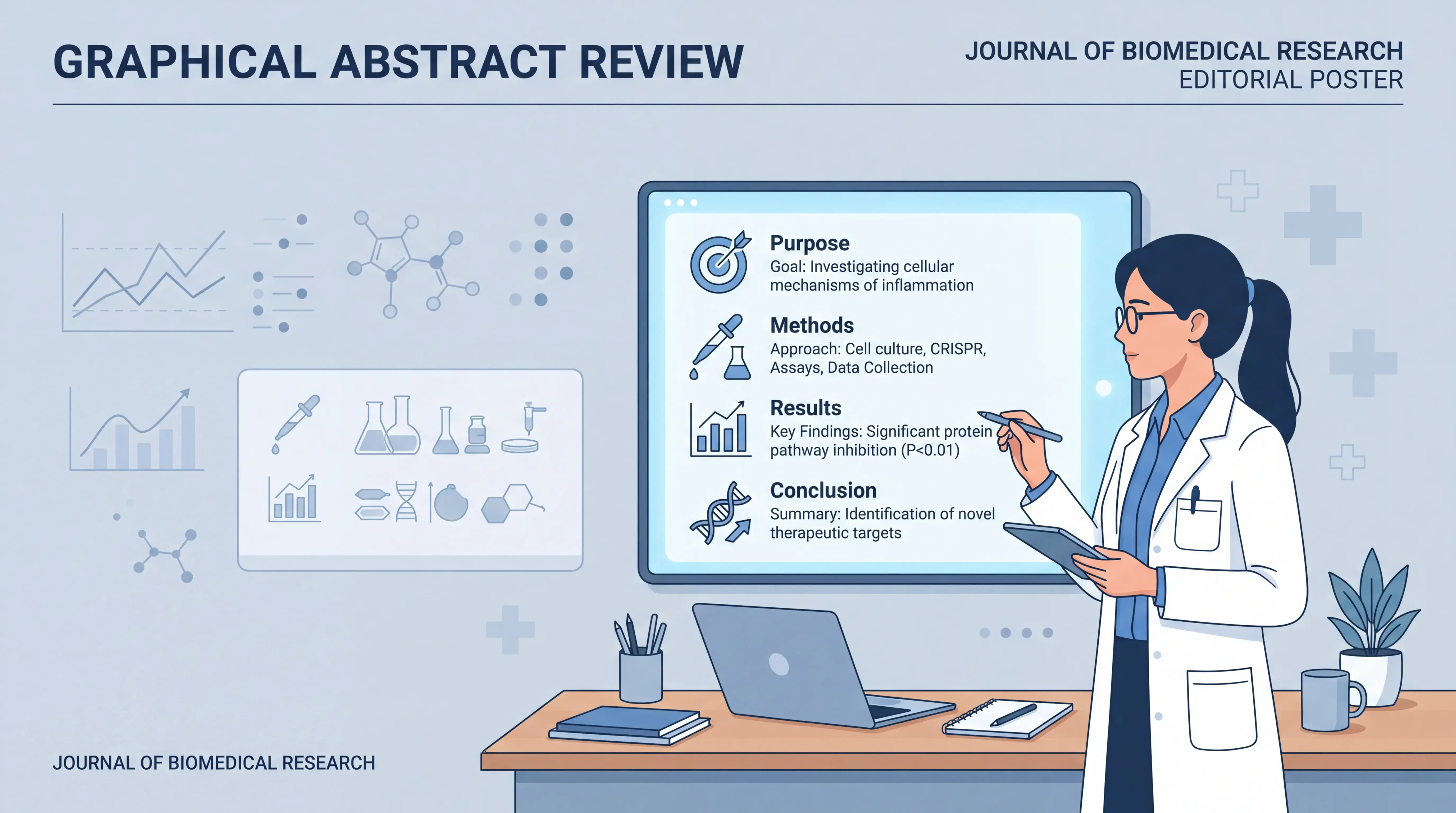
Before opening any design tool, define the one-sentence message of your essay. Ask: What is the study about, what was done, what was found, and why does it matter? That is the backbone of an effective graphical abstract.
Use the standard abstract logic:
- Background or purpose
- Methods
- Main results
- Conclusion or significance
This matches how many structured abstracts are written in scientific publishing. It also keeps the visual content aligned with the manuscript, which improves trust and readability.
2.2 Remove nonessential details
A common mistake is trying to show too much. A graphical abstract is not the full paper. It should not include every variable, subgroup, or statistical output.
Focus on the main pathway or outcome. If your paper has multiple findings, choose the one that best represents the study’s clinical or scientific value. Clarity beats completeness in this format.
3. Use a clean visual structure
3.1 Follow a left-to-right or top-to-bottom flow
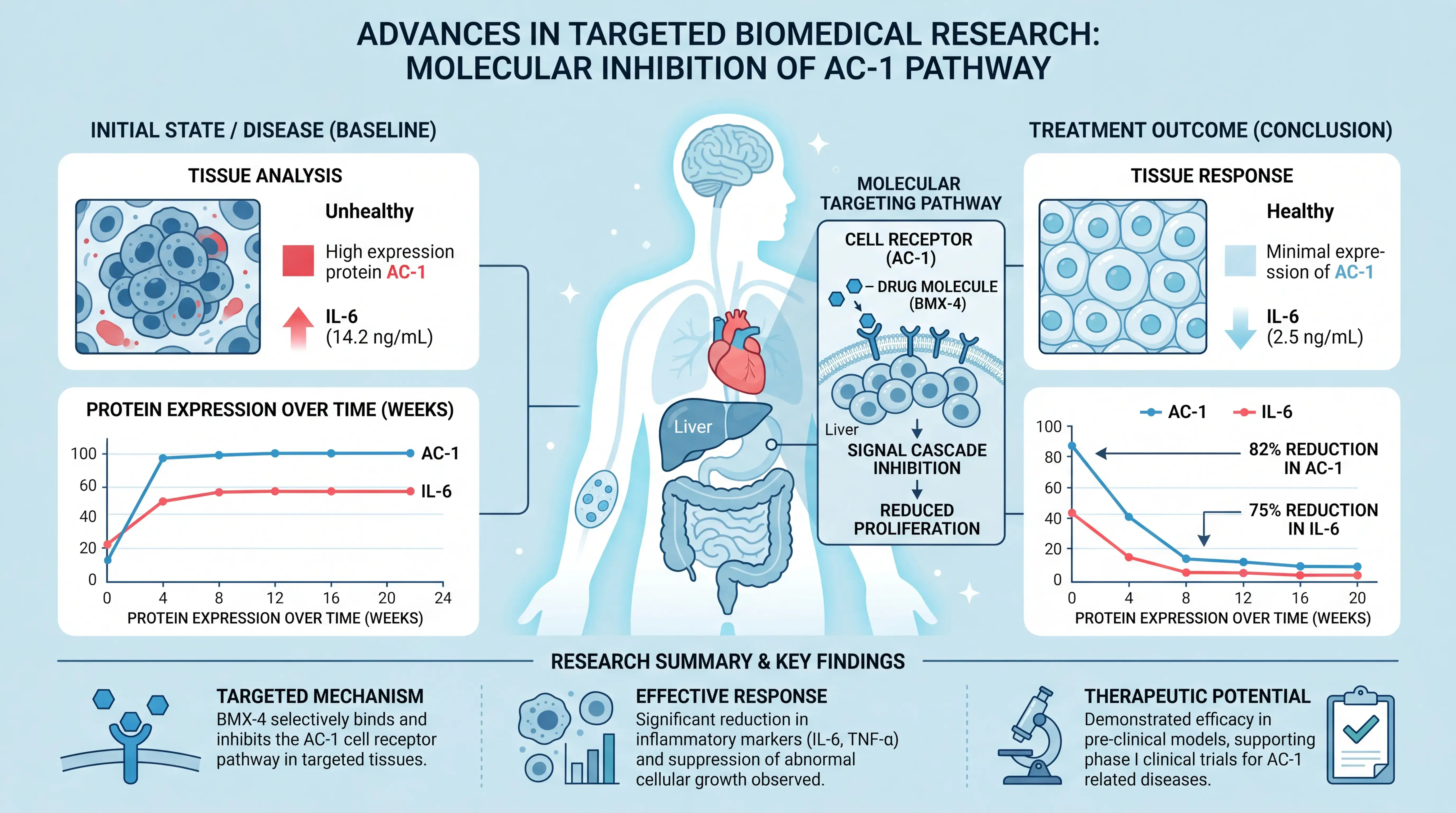
Readers should understand the figure instantly. A simple directional flow works best. For example, move from problem to method to result to implication. This mirrors how most scientific readers process information.
Avoid forcing the reader to search for the starting point. If the eye has to work too hard, the message is lost. Boxes, arrows, and labels should guide attention, not compete for it.
3.2 Keep the layout balanced
Use consistent spacing. Give each section enough room. Do not overload one side of the figure with text while leaving the other side empty. Balance improves readability and makes the graphic look professionally prepared.
A practical rule is to use one main idea per visual block. That keeps the figure readable on a screen, in a submission portal, and in a journal listing page. Well-spaced content looks more authoritative.
4. Write for speed and accuracy
4.1 Use short labels, not paragraphs
A graphical abstract is not an essay in miniature. Use short phrases. Replace full sentences with concise scientific labels when possible. For example, write “Reduced inflammation” instead of “The intervention significantly reduced inflammatory markers.”
This keeps the figure compact and easier to scan. It also reduces the risk of overexplaining results that belong in the main text.
4.2 Match wording to the manuscript
Never introduce claims that are not supported by the article. Editors quickly spot mismatch between the graphic and the paper. That can weaken confidence in the submission.
Use the same terminology for population, intervention, outcome, and disease names. If the manuscript says “patients with type 2 diabetes,” do not shorten it to “diabetics” unless the journal allows it and the meaning stays exact. Precision matters.
5. Design for medical and research audiences
5.1 Choose symbols that are instantly recognizable
In medical writing, a figure works best when the audience can decode it immediately. Use familiar symbols, simple charts, and standard clinical icons only when they improve understanding. Avoid abstract art or decorative elements that add noise.
Good icons can help represent:
- Patient groups
- Sample collection
- Analysis steps
- Clinical outcomes
Every icon should support meaning, not replace it.
5.2 Use color with restraint
Color should organize information, not distract from it. Use one or two main colors, plus one accent color if needed. Strong contrast improves legibility, especially in journal previews and mobile viewing.
Avoid overusing red, green, or multiple saturated shades. They can create visual confusion and may not reproduce well in print. For a professional scientific tone, restrained color usually performs better.
6. Follow a practical editing workflow
6.1 Test the figure at thumbnail size
Many readers first see a graphical abstract as a small image on a journal page. Shrink your figure and check whether the message is still obvious. If not, simplify it.
A useful checklist:
- Can the title be understood in seconds?
- Can the workflow be followed without explanation?
- Are the main findings visible?
- Is the conclusion obvious?
If any answer is no, revise the design.
6.2 Ask a colleague to interpret it
Before submission, show the graphic to a colleague who has not read the paper. If they can explain the study’s purpose and result in one sentence, your design is likely working. If they cannot, the figure needs simplification.
This is one of the most reliable quality checks because it tests real-world comprehension, not just visual appeal. A good graphical abstract should survive first-time viewing.
7. How tools can speed up the process
7.1 Use AI-assisted drafting carefully
Many researchers struggle not with the science, but with turning the science into a visual summary. This is where tools like scifocus.ai can help. They can support faster structuring, cleaner wording, and more consistent presentation.
For busy clinicians and graduate researchers, that means less time spent formatting and more time refining the scientific message. A tool cannot replace judgment, but it can reduce production friction and help you turn a rough concept into a submission-ready visual faster.
7.2 Keep human review in the loop
Even with automation, final review must stay with the author. Check every label, arrow, and claim against the manuscript. Ensure the graphic reflects the same evidence level as the paper.
Technology can accelerate the process, but scientific accuracy still depends on expert review. That is the safest way to create a graphical abstract that editors trust.
Conclusion
A graphical abstract that editors notice is not flashy. It is clear, accurate, and easy to scan. Build it from the paper’s core message. Keep the layout simple. Use short labels. Test it at thumbnail size. Most importantly, make sure every element matches the manuscript.
For medical students, doctors, and researchers, this approach improves both editorial impression and reader understanding. If you want to save time and produce a more polished visual summary, try scifocus.ai as part of your workflow. It can help you shape the structure faster while keeping the final scientific judgment in your hands.
Did you like this article? Explore a few more related posts.
Start Your Research Journey With Scifocus Today
Create your free Scifocus account today and take your research to the next level. Experience the difference firsthand—your journey to academic excellence starts here.