

Choosing the Right Graph for Your Data
Introduction
Choosing the right graph for your data is not a design detail. It is a scientific decision. For medical students, doctors, and researchers, the wrong chart can hide trends, distort comparisons, and weaken an essay or manuscript. The right graph makes the message clear in seconds. In clinical and research writing, that clarity supports trust, speed, and publication quality. A well-chosen graph should let readers understand the data without reading the full methods first.
1. Understand What Your Data Is Trying to Show
1.1 Continuous change, comparison, or composition
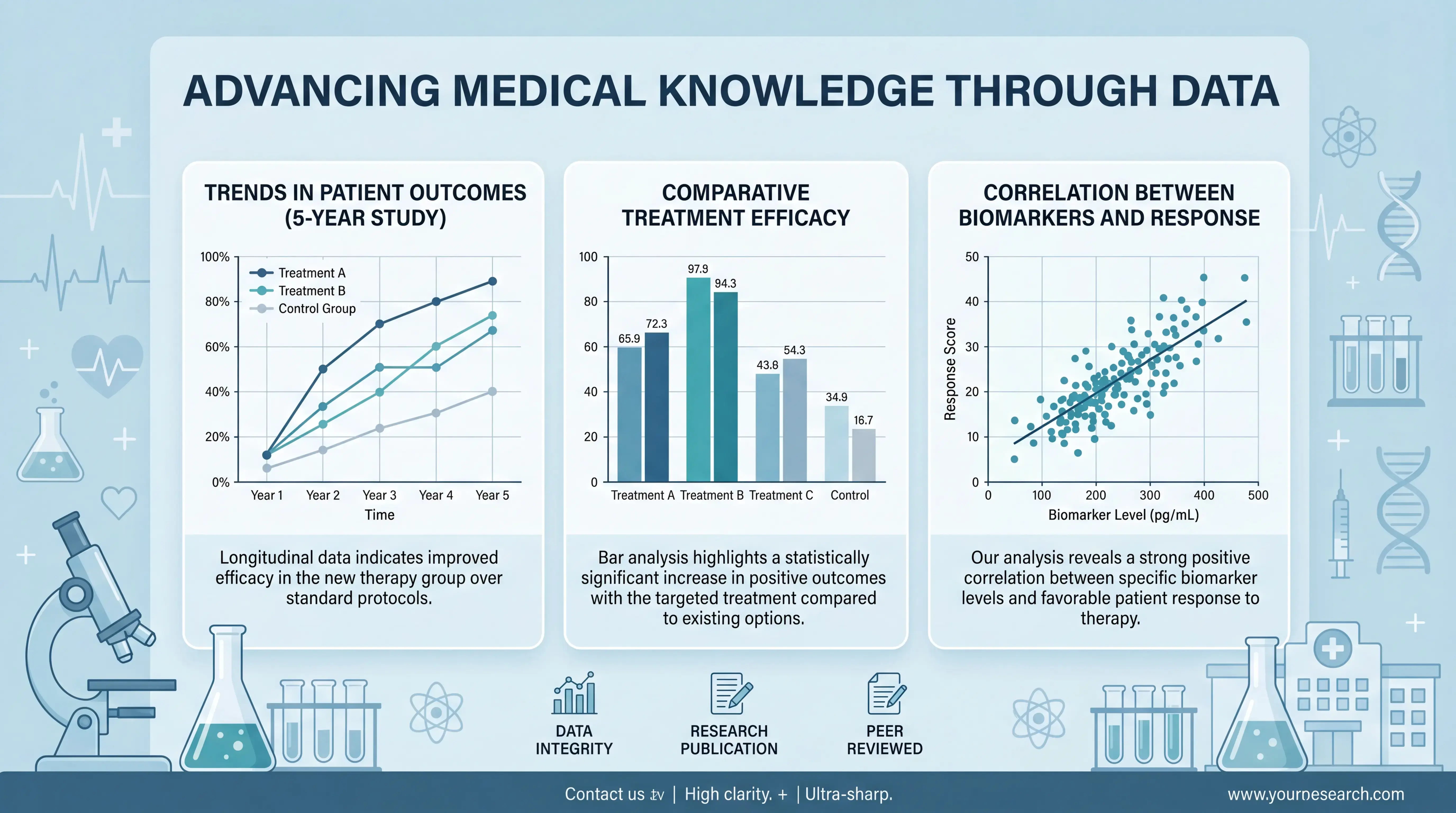
The first step in choosing a graph is to define the question. Are you showing change over time, differences between groups, or a relationship between two variables? Each goal needs a different visual structure.
For example, an XY graph is ideal when both X and Y are numeric. It shows how one variable changes as the other changes. This is common in cell proliferation curves, dose-response studies, and standard curves. If the reader must infer the trend from the text, the graph is not doing its job.
By contrast, group comparisons often fit a column or bar chart. Categorical groups such as treatment arms, disease subtypes, or experimental conditions should not be forced into an XY format. The graph should match the data type, not the other way around.
1.2 Match the graph to the statistical question
A graph is not just decoration. It should reflect the analysis. If you are comparing means across groups, a column chart with error bars may be appropriate. If you are tracking values across time or concentration, an XY line graph is usually better.
In medical research, this distinction matters. A survival trend, enzymatic response, or absorbance curve can be misleading if shown as a simple category chart. The structure of the graph should preserve the meaning of the data.
2. When an XY Graph Is the Best Choice
2.1 Use XY graphs for paired numeric variables
An XY graph is built from two variables and two axes. It is used to show the relationship between X and Y. The points may be connected with lines, fitted curves, or shown as isolated markers. This format is widely used in biomedical experiments.
A standard example is an MTT assay. Time is placed on the X-axis, and absorbance is placed on the Y-axis. In this case, the graph shows how cell activity changes across days after transfection or treatment. The value of the XY graph is its ability to show a trend immediately.
This is especially useful in an essay or paper where you need to compare multiple conditions. Readers can see whether a curve rises, falls, or plateaus without digging into the text.
2.2 Choose the right XY input format
Prism-style workflows show that XY data can be entered in different ways. The correct format depends on how your data were collected.
Common input types include:
- One X value with one Y value
- One X value with multiple replicate Y values
- One X value with precomputed mean and error values
If you still have raw data, use the replicate format. This reduces manual transfer errors and preserves flexibility for later analysis. If values are already processed elsewhere, inputting mean with SD or SEM is faster, but it gives fewer graph options.
Best practice: keep raw data as long as possible. That supports traceability and makes your figure easier to defend during peer review.
2.3 Use lines only when the sequence matters
A connecting line is useful when X values have a real order, such as time, concentration, or dose. It helps readers see progression. But lines should not be used just to make a figure look polished.
If the X values are categories with no natural order, a line can imply continuity that does not exist. In that case, a scatter plot or column chart is safer.
3. When a Column or Bar Chart Is Better
3.1 Use categorical graphs for group comparisons
If your X-axis is made of categories, use a column chart or bar chart. This is common in tissue studies, treatment comparisons, and phenotype classification. Here, the X-axis is not numeric. It is defined by group labels.
A good example is comparing si-NC, si-BCRT1, or overexpression groups in a tube formation assay. The graph should show differences across conditions clearly. A category chart is best when the main message is “which group is higher or lower.”
For medical readers, this matters because the visual language must match the biology. A treatment group is not a time point. A disease class is not a concentration. Mixing these logic types reduces clarity.
3.2 Keep the order meaningful
Default software sorting can make a chart harder to read. If the order is arbitrary, readers need extra time to interpret it. Sort groups by clinical logic, biological sequence, or effect size.
For example:
- Control first, treatment groups next
- Low dose to high dose
- Normal tissue to diseased tissue
- Early to late stage
A clear order improves scanability and makes the figure easier to remember.
3.3 Use error bars when variability matters
In biomedical research, raw values are rarely enough. Error bars help show spread. Depending on the study design, you may use SD, SEM, or precomputed error values. The important point is consistency between the graph, legend, and methods.
Do not hide variability. If replicate values vary, readers need to see it. That supports transparency and scientific trust.
4. Avoid Common Visualization Mistakes
4.1 Do not distort the baseline
Baseline handling changes how a graph is perceived. In bar charts, the origin should usually start at zero unless there is a specific analytical reason not to. If the baseline is cut off, the visual difference between groups may look larger than it really is.
This is a frequent problem in scientific figures. It can make a chart look dramatic, but it weakens credibility. In medical and research communication, accuracy matters more than visual drama.
4.2 Do not overload the figure
A figure should communicate one main message. If you add too many groups, too many line styles, or too many annotations, the graph becomes cluttered.
Use these rules:
- Limit the number of colors
- Keep labels short
- Avoid unnecessary gridlines
- Use consistent symbol sizes
- Place the legend where it does not block data
If the graph is hard to read at a glance, simplify it.
4.3 Use readable labels
Long labels often break layout. In those cases, rotate labels slightly, shorten wording, or move detail into the caption. The goal is to preserve readability without losing meaning.
This is especially important for manuscripts and academic essay writing. A figure may be strong scientifically but still fail visually if axis labels are cramped or unclear.
5. A Practical Workflow for Selecting the Right Graph
5.1 Ask four questions before you plot
Before building any figure, answer these four questions:
- Is the X-axis numeric or categorical?
- Is the Y-axis raw, repeated, or already summarized?
- Is the goal comparison, trend, or relationship?
- Do I need to show variation across replicates?
These questions usually point you to the correct chart type quickly. In many cases, the choice is either XY, column chart, or scatter-based visualization.
5.2 Build from raw data first
Whenever possible, start with raw measurements. Then decide whether to show:
- Individual points
- Mean with SD
- Mean with SEM
- Fitted trend line
This reduces risk and improves reproducibility. It also makes it easier to revise the figure if reviewers ask for another presentation style.
5.3 Use software to refine, not rescue, weak logic
Good software can improve a figure, but it cannot fix a mismatch between data and chart type. You still need to choose the correct graph first.
That is where tools like scifocus.ai can help. It supports researchers who need faster, cleaner, publication-ready writing and presentation. When you are preparing a manuscript, thesis, or scientific essay, a workflow that helps organize content and present data clearly can save time and reduce avoidable errors.
6. How to Make the Figure Publication-Ready
6.1 Focus on clarity, not decoration
A publication-ready graph should be simple, accurate, and easy to interpret. Use consistent fonts, visible axis titles, and a stable layout. Choose colors that remain distinct in print.
If the figure is for a journal or thesis, test it in black and white first. If the meaning survives without color, the graph is usually robust.
6.2 Align the visual style with the journal
Different journals have different figure standards. Some prefer minimal gridlines. Others require precise error bar formatting or specific line widths. Always check the target journal instructions.
This is not optional. A technically correct graph can still be rejected or revised if the presentation is noncompliant.
6.3 Keep figure captions factual
The caption should explain what the graph shows, what the error bars mean, and how many replicates were used. It should not repeat the discussion section.
A strong caption helps the graph stand alone. That is a major advantage in scientific communication.
Conclusion
Choosing the right graph for your data is about scientific accuracy, not style. If the data are numeric and sequential, an XY graph is often the right choice. If the data are categorical, a column chart or bar chart is usually better. If variability matters, show it clearly. The best figure is the one that helps readers understand the result immediately and correctly.
For medical students, doctors, and researchers, this skill improves manuscripts, presentations, and every data-heavy essay. If you want a faster way to organize, refine, and present scientific content, explore scifocus.ai. It can support a cleaner workflow from data to draft to final submission.
Did you like this article? Explore a few more related posts.
Start Your Research Journey With Scifocus Today
Create your free Scifocus account today and take your research to the next level. Experience the difference firsthand—your journey to academic excellence starts here.